Acrylic color mixing is an essential skill for artists, enabling the creation of vibrant and subtle hues. This guide provides a structured system to build confidence in mixing colors, from bold florals to soft skin tones, through practical exercises and a comprehensive reference tool.
1.1 Importance of Color Mixing in Acrylic Painting
Color mixing is fundamental to acrylic painting, as it unlocks endless creative possibilities. By mastering color mixing, artists can achieve precise hues, expand their palette, and convey emotions effectively. It allows for the creation of subtle shifts in tone and texture, essential for realistic and expressive artworks. Mixing colors also enables artists to save money by minimizing the need for multiple pre-mixed tubes. A well-planned color mixing strategy ensures consistency and harmony in a piece, while experimentation fosters innovation and personal style. The ability to mix colors confidently bridges the gap between inspiration and execution, making it a cornerstone of artistic development.
1.2 Brief Overview of Acrylic Paint Characteristics
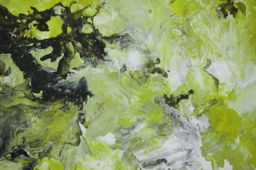
Acrylic paint is a versatile and fast-drying medium, making it ideal for dynamic artistic expressions. It can be applied thickly for textured effects or thinly for smooth, translucent layers. Acrylics are water-soluble when wet but become water-resistant once dry, allowing for layered techniques. The paint is available in heavy-body and fluid forms, each offering unique textural possibilities. Pigments vary in lightfastness and opacity, with professional grades providing superior color retention. Acrylics can be mixed with mediums to alter viscosity, drying time, or finish, from matte to glossy. This adaptability, combined with its durability, makes acrylic paint a popular choice for both beginners and experienced artists, suitable for a wide range of creative applications.
Understanding Color Theory Basics
Color theory fundamentals, including the color wheel, primary and secondary hues, warm and cool tones, and color bias, form the cornerstone of effective acrylic color mixing.
2.1 The Color Wheel: A Foundation for Mixing Colors
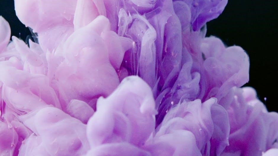
The color wheel is a circular diagram that displays the relationship between colors, helping artists understand how they interact; It is divided into primary colors—red, yellow, and blue—and secondary colors like orange, green, and violet, which are created by mixing two primaries. Warm colors, such as reds and oranges, evoke warmth and energy, while cool colors like blues and greens convey calmness. The color wheel is a vital tool for predicting mixtures, identifying complementary colors, and creating harmonious palettes. By studying it, artists can make informed decisions when mixing acrylic paints, ensuring their desired hues are achieved effectively. This foundational knowledge simplifies the process of experimenting with colors and expanding creative possibilities.
2.2 Primary and Secondary Colors: The Building Blocks
Primary colors—red, yellow, and blue—are the fundamental building blocks of color mixing, as they cannot be created by mixing other colors together. Secondary colors, including orange, green, and violet, are derived by combining two primary colors in specific proportions. For instance, mixing red and yellow produces orange, while blue and yellow create green. These colors form the basis of the color wheel and are essential for understanding how to mix acrylic paints effectively. By mastering the use of primary and secondary colors, artists can create a wide range of hues and tones, from vibrant florals to subtle skin tones. This foundation is crucial for achieving consistency and control in color mixing, allowing for endless creative possibilities in acrylic painting.
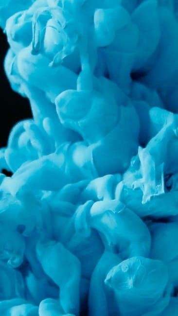
2.3 Warm and Cool Colors: Understanding Color Temperature
Warm colors, such as red, orange, and yellow, evoke warmth and energy, often associated with sunlight and heat. Cool colors, like blue, green, and violet, convey calmness and serenity, reminiscent of water and shade. The distinction between warm and cool hues is rooted in their positions on the color wheel and their emotional impact. When mixing acrylics, understanding color temperature is crucial for creating dynamic contrasts and moods. For example, mixing a warm red with a cool blue can produce a rich, muted purple. This concept also applies to skin tones, where warm and cool undertones help achieve realistic flesh colors. Mastering warm and cool color mixing enhances the emotional depth and visual balance in a painting.
2.4 Color Bias: How Pigments Influence Mixtures
Color bias refers to the tendency of a pigment to lean toward a specific hue when mixed with others. This inherent property of pigments significantly impacts acrylic color mixing. For instance, Phthalo Green (Blue Shade) has a strong blue bias, making it ideal for creating cool, vibrant greens. Similarly, Quinacridone Crimson leans toward blue, producing rich, cooler reds. Understanding color bias is crucial for predicting mixture outcomes and achieving desired hues. By selecting pigments with known biases, artists can better control the direction of their color mixtures. This knowledge also helps in maintaining consistency when working with different brands or types of acrylic paints, as pigment loads and biases can vary slightly between manufacturers.
Essentials of Acrylic Paint
Understanding acrylic paint is crucial for effective color mixing. Key factors include types like heavy body and fluid acrylics, viscosity, texture, and drying time, all affecting mixtures.
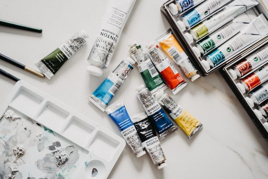
3.1 Types of Acrylic Paint: Heavy Body vs. Fluid
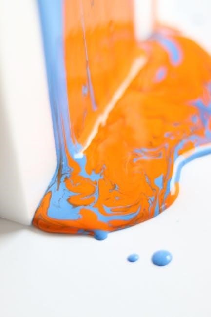
Acrylic paints come in two main forms: heavy body and fluid. Heavy body acrylics are thick and buttery, ideal for textured brushstrokes and impasto techniques. They retain their vibrant color and are perfect for mixing bold, rich hues. Fluid acrylics, on the other hand, have a thin, pourable consistency, making them great for blending, glazing, and creating smooth transitions. Both types can be mixed together, allowing artists to achieve a wide range of effects. Understanding the differences in consistency and pigment load is key to mastering color mixing. Heavy body paints hold more pigment, while fluid acrylics are lighter but offer flexibility in layering. This versatility makes acrylics a favorite for artists seeking to explore diverse styles and techniques.
3.2 Viscosity and Texture: How It Affects Mixing
Viscosity and texture play a crucial role in acrylic color mixing. Heavy body paints, with their thick consistency, hold more pigment, resulting in richer, more vibrant colors. This makes them ideal for creating bold, textured mixes. Fluid acrylics, being thinner, allow for smoother blending and subtle transitions. When mixing, the viscosity of the paints can affect the final consistency and appearance of the mixture. Combining heavy body and fluid acrylics enables artists to achieve a balance between color intensity and blending ease. Understanding how these properties interact is essential for controlling the outcome of mixes, whether aiming for thick impasto effects or delicate, transparent layers. This duality in texture offers endless possibilities for artistic expression and technique exploration in acrylic painting. Proper handling of viscosity ensures desired results in every piece.
3.3 Drying Time: A Key Factor in Acrylic Mixing
Drying time is a critical factor in acrylic color mixing, as acrylics dry rapidly compared to other paints. This fast-drying property can make blending colors challenging, especially when aiming for smooth transitions or subtle shifts in tone. Artists must work quickly to mix and apply colors before they set. However, this quick drying also allows for rapid layering and texture building, enabling artists to achieve complex compositions efficiently. To manage drying time, techniques like glazing (applying thin, translucent layers) or wet-on-wet (adding fresh paint to damp layers) can be employed. Understanding and adapting to acrylics’ drying characteristics is essential for mastering color mixing and achieving desired effects in your artwork. Proper timing and technique ensure optimal results. The fast-drying nature of acrylics demands precision and planning. Always consider drying time when mixing colors. It is a key element in the creative process. Effective use of drying time enhances artistic outcomes. Drying time influences both mixing and application. Plan your workflow accordingly. Acrylics’ fast-drying property can be both a challenge and an advantage. Use it to your benefit. Drying time is a fundamental aspect of acrylic painting. Respect it to achieve your artistic vision; Always consider drying time when mixing colors. It is a key element in the creative process. Effective use of drying time enhances artistic outcomes. Drying time influences both mixing and application. Plan your workflow accordingly. Acrylics’ fast-drying property can be both a challenge and an advantage. Use it to your benefit. Drying time is a fundamental aspect of acrylic painting. Respect it to achieve your artistic vision. Always consider drying time when mixing colors. It is a key element in the creative process. Effective use of drying time enhances artistic outcomes. Drying time influences both mixing and application. Plan your workflow accordingly. Acrylics’ fast-drying property can be both a challenge and an advantage. Use it to your benefit. Drying time is a fundamental aspect of acrylic painting. Respect it to achieve your artistic vision. Always consider drying time when mixing colors. It is a key element in the creative process. Effective use of drying time enhances artistic outcomes. Drying time influences both mixing and application. Plan your workflow accordingly. Acrylics’ fast-drying property can be both a challenge and an advantage. Use it to your benefit. Drying time is a fundamental aspect of acrylic painting. Respect it to achieve your artistic vision. Always consider drying time when mixing colors. It is a key element in the creative process. Effective use of drying time enhances artistic outcomes. Drying time influences both mixing and application. Plan your workflow accordingly. Acrylics’ fast-drying property can be both a challenge and an advantage. Use it to your benefit. Drying time is a fundamental aspect of acrylic painting. Respect it to achieve your artistic vision. Always consider drying time when mixing colors. It is a key element in the creative process. Effective use of drying time enhances artistic outcomes. Drying time influences both mixing and application. Plan your workflow accordingly. Acrylics’ fast-drying property can be both a challenge and an advantage. Use it to your benefit. Drying time is a fundamental aspect of acrylic painting. Respect it to achieve your artistic vision. Always consider drying time when mixing colors. It is a key element in the creative process. Effective use of drying time enhances artistic outcomes. Drying time influences both mixing and application. Plan your workflow accordingly. Acrylics’ fast-drying property can be both a challenge and an advantage. Use it to your benefit. Drying time is a fundamental aspect of acrylic painting. Respect it to achieve your artistic vision. Always consider drying time when mixing colors. It is a key element in the creative process. Effective use of drying time enhances artistic outcomes. Drying time influences both mixing and application. Plan your workflow accordingly. Acrylics’ fast-drying property can be both a challenge and an advantage. Use it to your benefit. Drying time is a fundamental aspect of acrylic painting. Respect it to achieve your artistic vision.
The Color Mixing Process
The color mixing process involves combining primary colors to create a wide range of hues, using techniques like layering and blending. Tools like color charts help artists predict and achieve desired results, ensuring consistency and accuracy in their work. This process is essential for mastering acrylic painting, enabling the creation of vibrant, subtle, and complex colors tailored to any artistic vision.
4.1 Basic Mixing Techniques: Mixing Primary Colors
Basic mixing techniques begin with the three primary colors: red, yellow, and blue. These colors cannot be created by mixing others and form the foundation of all color mixing. By combining two primary colors, artists can produce secondary colors like green (blue + yellow), purple (blue + red), and orange (red + yellow). The ratios of the primaries will influence the hue and saturation of the resulting color. For example, adding more yellow to red creates a warmer orange, while more red produces a cooler tone. Starting with equal parts of two primaries is a good way to achieve a balanced secondary color. Experimenting with warm and cool versions of primaries can further expand the range of colors. This fundamental process is key to understanding how to mix any color effectively in acrylic painting.
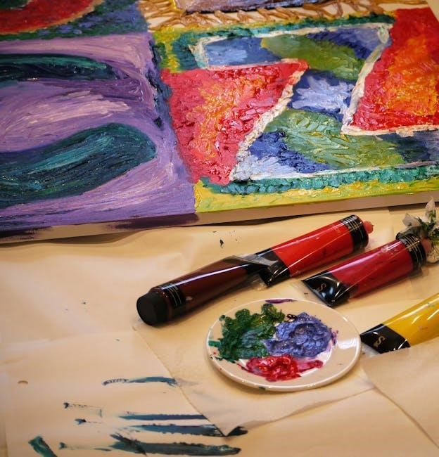
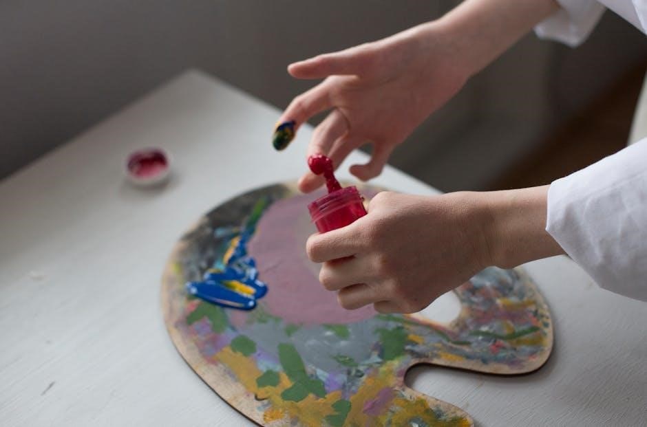
4.2 Creating a Color Chart: A Visual Guide
Creating a color chart is a valuable exercise for mastering acrylic color mixing. Start by selecting a range of primary colors, including both warm and cool versions, and arrange them along the top row and left column of a grid on canvas paper. This visual guide helps you see how colors interact when mixed. Each box in the grid represents a specific mixture, allowing you to document the proportions of each color used. Begin by mixing primary colors to create secondary hues, then expand to neutrals and skin tones. This chart becomes a personalized reference, saving time and paint. It also helps identify patterns and preferences, enhancing your ability to mix colors confidently and consistently in future projects. Regular use of the chart will deepen your understanding of color relationships and improve your mixing skills over time.
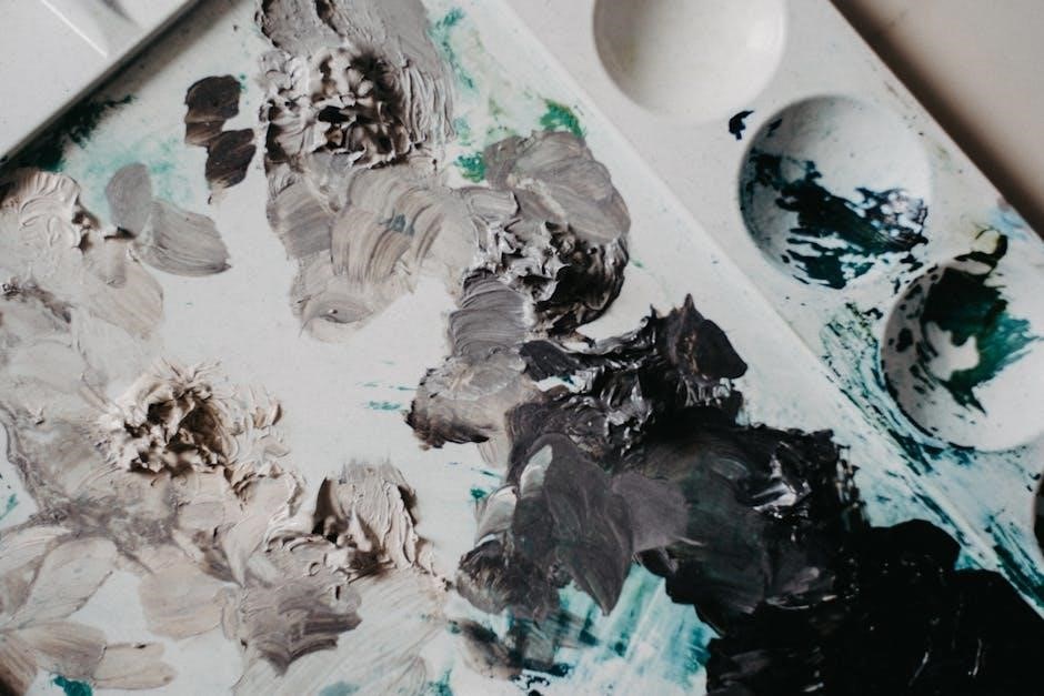
4.3 Mixing Neutrals: Browns, Grays, and Blacks
Mixing neutrals—browns, grays, and blacks—is a fundamental skill in acrylic painting. These colors are essential for adding depth, balance, and realism to your work. Browns can be created by mixing complementary colors like blue and orange or red and green, while grays are achieved by combining black and white or cooling warm colors with their complements. Blacks are typically mixed by blending dark blues or greens with reds. The ratio of colors and their biases significantly impact the final shade. For example, adding more blue to a brown mixture creates a cooler tone, while adding yellow results in a warmer brown. Experimenting with these combinations allows you to achieve a wide range of neutrals, enhancing your ability to capture subtle shifts in value and tone in your paintings.
4.4 Mixing Skin Tones: Capturing Flesh Colors
Mixing skin tones in acrylic paint requires a subtle balance of warm and cool colors to achieve realistic flesh hues. Start with a base tone by mixing Titanium White with touches of Yellow Ochre or Burnt Sienna for warmth. Add small amounts of Red or Cadmium Red Light to deepen the color. For cooler tones, incorporate Bluish Greens or Ultramarine Blue to create shadows. To refine your mix, layer glazes or adjust the ratio of warm to cool pigments. Experimenting with these combinations allows you to capture a wide range of skin tones, from fair to deep complexions. Remember, subtle adjustments in color temperature and saturation can make your flesh tones more convincing and lifelike in your paintings.
Practical Exercises for Mastery
Engage in step-by-step mixing exercises to refine your skills. Create a color chart to document ratios and results, ensuring consistency and mastery of acrylic color mixing techniques.
5.2 Creating Your Own Personal Color Mixing Guide
5.1 Step-by-Step Mixing Exercises
Start with basic color mixing exercises to build confidence. Begin by mixing primary colors to create secondary hues, then progress to neutrals like browns and grays. Experiment with small amounts of paint to observe how colors interact. Document each mixture, noting the ratios used, to track your progress. Practice creating skin tones by blending warm colors with neutrals. As you advance, try mixing vibrant colors like greens and oranges to understand saturation and contrast. These exercises will help you develop a keen eye for color and improve your ability to replicate shades accurately. Over time, this practice will refine your technique, making color mixing intuitive and efficient.